To get an edge on your competition, it’s important to offer the best user experience possible for your users.
After all, when people are satisfied by the experience and interaction with your website, they’re more likely to return, which means you’ll have more opportunities to reach out to them and convert them into customers! and even if your website’s goal isn’t conversion a good UX will let a great perception and idea of your brand in the visitor’s mind.
A website’s user experience, or UX, refers to the ease with which people can use a website and its features to accomplish their goals and find what they’re looking for, whether that’s a product on an e-commerce website or more information about the company that owns the site.
As people are spending more and more time online, they will only continue to demand better experiences when using websites, so it’s critical that you improve your user experience, now and in the future, to keep them coming back for more!
So first of all, why should you care about this?
What if you design an amazing-looking website, but it provides a bad experience to visitors so it ends up with nobody using it?
UX boosts a website’s user experience by making everything run smoother. Aside from an aesthetically pleasing design, users should be able to find what they’re looking for easily. Having a user-friendly website makes visitors happy and encourages them to come back often.
A great user experience increases trust between a company and its audience. This is vital because it creates brand loyalty that can help build long-term business relationships.
Another benefit of having a positive user experience is that it gives you more search engine optimization (SEO) opportunities. When someone lands on your site, they should feel comfortable and confident enough to explore further.
With good UX in place, Google will notice how easy it is for people to navigate through your site and that they are passing a good amount of time exploring it and not just bouncing and it will reward you with higher rankings in their search results. All this will automatically result in higher conversion rates for your websites and more sales for your business!
If people are satisfied with your site’s overall experience, they are more likely to share it with others via social media or word of mouth.
⇒ Before we start! It’s about them not you!
The best user experience design is based on understanding your users. It starts with a series of questions, like what problem are you trying to solve? What feature set are you delivering? Are your users local or international? And, most importantly, how will they feel when they use your website? will it be delightful, frustrating, or somewhere in between?
You need to know if there is anything unique about your target market that might affect their perception of your site or service. Understanding these questions helps you build a better website with great UX.
Start by mapping out every step of your customer’s journey from start to finish, including any steps along their path where they might become confused or frustrated. Once you know where these trouble spots are, you can start optimizing your website to avoid confusing visitors or scaring them away altogether.
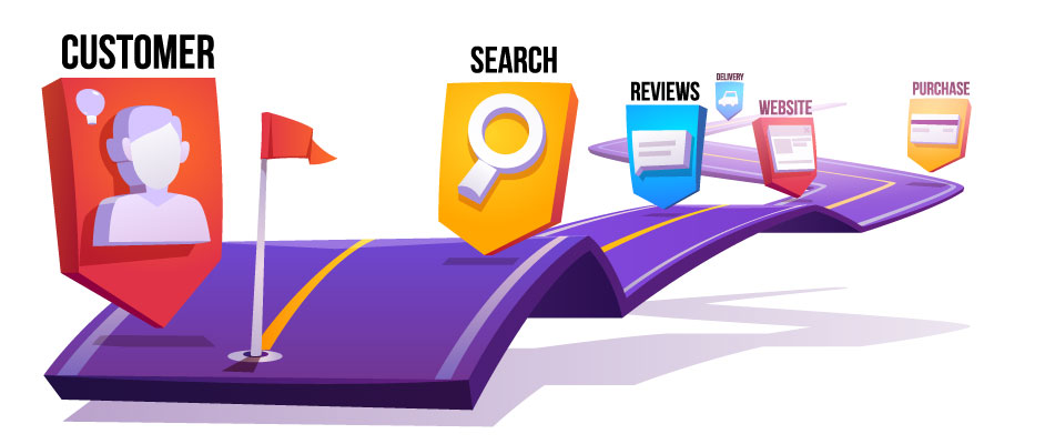
For example, in the case of an e-commerce site, if you notice that many people are abandoning at the checkout stage, consider adding alternative payment methods, labels that guarantee that your site’s payment methods are 100% secure and other reassuring guarantees to give them more confidence to place their order.
The more clearly and concisely you explain each stage of your customer journey, from searching for products to completing an order, the easier it will be for visitors to find what they need and complete their purchase without issue.
If you followed the previous steps and instructions you should have a good understanding of your site’s user experience status and where to start with your audience and mission always in mind!
A website that is accessible and usable by all users is more likely to receive traffic and conversions than a website that has inaccessible features.
Accessibility testing should begin with an audit of your page’s code, including your site navigation, buttons, form fields, content areas, etc. Audit your code for any potential accessibility issues before you even launch your page. There are many tools available to help make sure your site is compliant with current standards.
One such tool is WAVE (Web Accessibility Evaluation Tool). This tool will run a scan on your website, as well as give you feedback on what needs improvement.
![]()
Another great resource for ensuring accessibility compliance is WebAIM (Web Accessibility in Mind). This resource provides information about web accessibility guidelines, tests, and tutorials.
Google and other search engines now penalize websites that take too long to load, meaning you could fall out of favor if your website loads more slowly than those of your competitors.
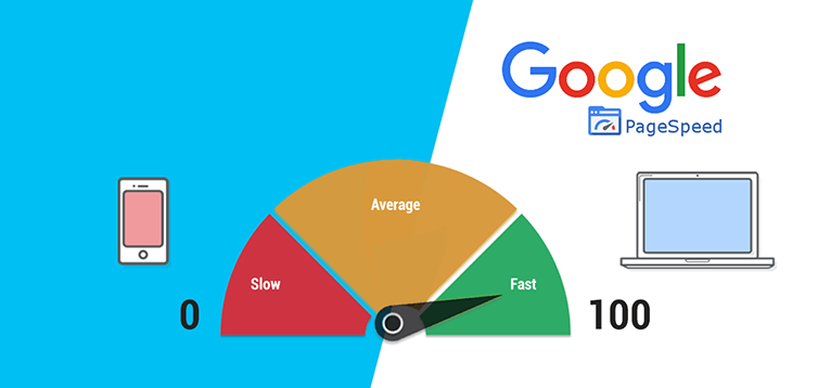
With so many people using mobile devices with spotty connections, it’s even more important for sites to load quickly.
If your site is slow and takes more than 2-3 seconds to load, you will lose a big part of your visitors, by letting your site take too much to load you are basically telling your visitors they can go elsewhere, and they probably will.
One way to check how fast your site loads is to use a tool like Pingdom, GTMetrix, or Google Page Speed Insights.
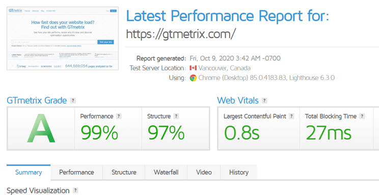
These tools will tell you how long it takes for a page on your site to load, as well as give you suggestions on how you can improve its speed and make sure that you aren’t missing out on leads because of slow load times.
It’s essential that you pay attention to analytics because it can help you better understand your visitors. Analytics like Google Analytics and HotJar will give you insight into your visitors’ behavior and how they interact with your website.
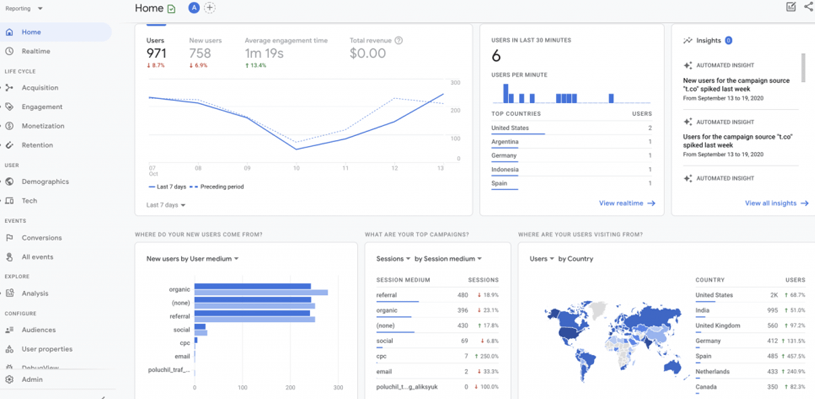
You’ll know how they move through your site, which pages they’re drawn to most, and what actions they take on those pages. Armed with these insights, you can then apply usability best practices that are specific to your site in order to improve conversions.
The navigation of your website is one of its most important aspects. If people cannot quickly and easily navigate your site, they’ll leave, abandoning their search for what they wanted. If you want your site’s user experience to be modern and on-point, start by consolidating all of your website’s navigation into one main menu bar.
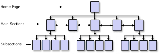
Keeping visitors focused on just a few prominent links will help them find what they’re looking for quicker. It’s also important to make sure that each link leads directly to its intended destination, and avoid redirecting users or sending them through unnecessary loops if possible.
A visual hierarchy will help your readers quickly identify what they should be reading and what they can skip over.
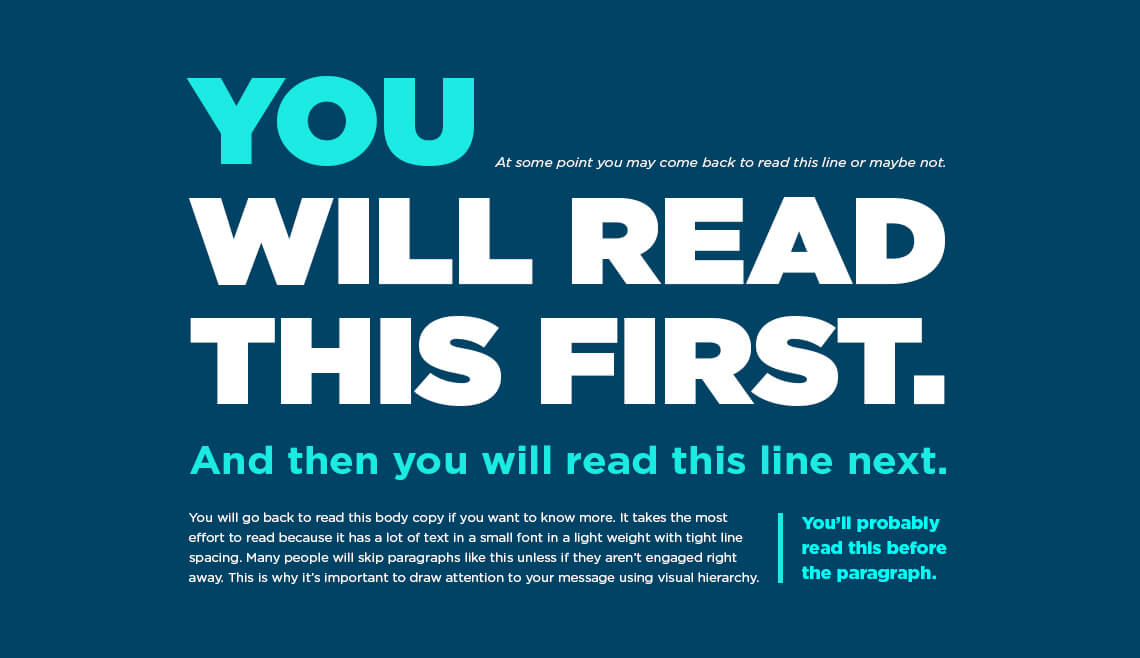
Visual hierarchies often include things like headers, lists, images, and other formatting elements. These elements allow your readers to understand which information is most important without having to examine all the text.
White space is space on a page where there aren’t any design elements like text, logos, images, or ads. While white space may seem useless in itself, it’s actually an important tool in creating usable and readable websites.
Having white space makes your site’s most important information easier to find and allows you to use less of a busy design style. A site with too many design elements can often be confusing and overwhelming for visitors.
White space makes all of your pages look cleaner, and it gives users a place for their eyes to rest. You don’t have to use your entire screen real estate in fact, it’s best if you avoid long blocks of text on one page. Instead, create small bite-sized chunks of content that are easy for users to digest (and read).
Don’t just use paragraphs of text. Use infographics, photos, and other visuals to illustrate your points or break up lengthy blocks of text (and readers will thank you for it). And never underestimate video, it can be an incredibly engaging form of content.
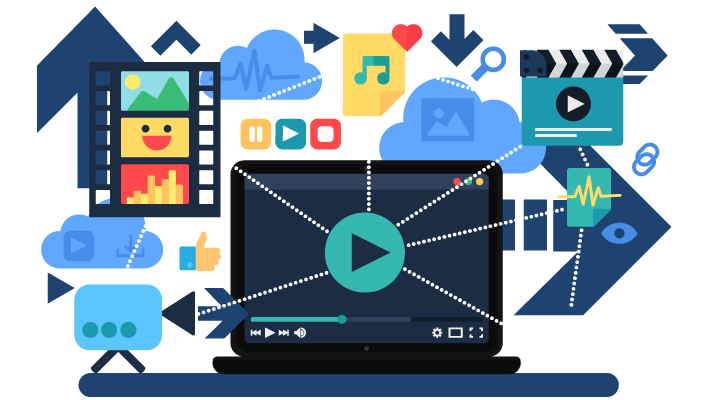
Showing data through visuals, like charts and graphs, makes it easier for your site’s visitors to understand key points. For example, if you have sales figures for a year on your website, display that information with a visual rather than just writing out figures.
People will be able to get more information from a single glance at an image than from reading paragraphs of numbers and text. And, as web design trends continue to shift toward a more visual approach (like using illustrations), using images in your content is an excellent way to keep up with modern trends while also improving usability.
If you don’t know how to create these types of graphics yourself, there are plenty of tools available online that can help like Canva. If you don’t want to go down that route, consider outsourcing it may cost some money upfront but can save time in the long run.
Every page on your website should have a clear call-to-action that drives your users toward some sort of conversion. This is especially true on pages that you know convert well, like your homepage or shop page.
Call-to-actions should be easily visible and clear for all users. If it doesn’t look obvious at first glance, think about what you can do to improve it. Their placement on your website matters too, you want them in places where users will see them and be motivated to act.
Just make sure they stand out so readers don’t miss them! And remember: You want visitors to take any action that benefits both parties, so make sure it aligns with their needs as well as yours.
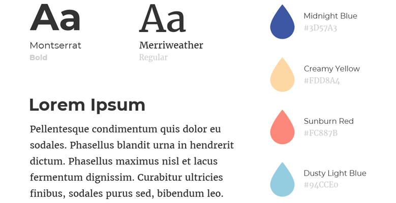
Yes, it’s super cool that your company uses a unique typeface or a bright color palette, but if it’s hard on your visitor’s eyes or it makes them frustrated, those aesthetic choices aren’t doing you any favors. To ensure your website is always providing an optimal user experience, start by choosing colors and fonts that are easy to read.
The easiest way to do so? Stick with industry standards: Black text on a white background is universally readable across devices and browsers, which means it’s always accessible (And even if you want to deviate from these standards, there are plenty of tools available that will help you pick colors and fonts based on how they look against various backgrounds like Siteimprove.)
This approach also makes it easier for visitors to use your site in different settings like outdoors, at night, etc. because there’s no guesswork involved. In addition, you need to make sure that your text is big enough for them to read easily, too
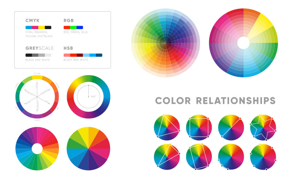
Understanding the color wheel and getting a little color theory 101 under your belt is a good idea because when you start combining colors, you want to make sure that they work well together.
The same for the typography, it’s a good idea to understand font types and pairing, this will elevate your design skills and also enable you to create a better user experience for your visitors.
Is your content scannable? It’s important that web users can easily skim and find what they’re looking for. Make sure headings, lists, and strong calls to action are prominent features of your content.
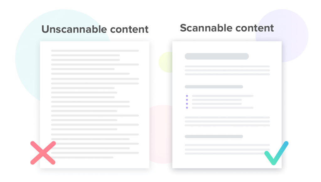
Content should be more than a block of text, it should be visually appealing with bullet points, images, video, etc. That way if people scroll through quickly they will still get a good understanding of what you want them to know.
With more people using mobile devices for shopping and browsing compared to desktops, it is more important than ever that you consider how your website looks and functions on these devices.
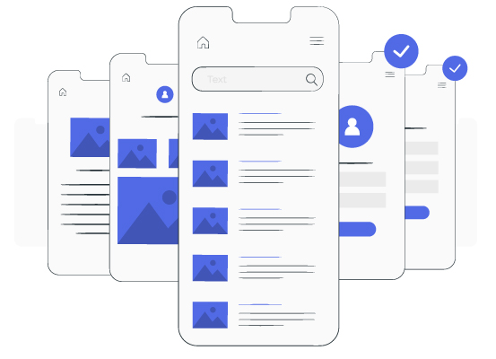
A poorly designed mobile website can ruin a customer’s experience and turn them away. With that in mind, make sure you design with your mobile user in mind.
Gone are those days when you could rely solely on desktop users. With more than 50% of all Internet traffic now coming from mobile devices, it’s critical for you to realize that your website needs to be mobile-friendly.
Consistency is key when it comes to keeping your website user-friendly. Users should never have to wonder where they are or how they got there, this is what gives them a sense of security that’s essential for their continued engagement.
If you have different styles, colors, and fonts across your site, you’re likely confusing users and potentially driving them away. Keep everything consistent in order to create a better experience.
Obviously, if your site is riddled with pop-ups, ads, inconsistent colors and fonts, auto-play videos, and sounds, visitors will leave. The moment a visitor leaves your site, you’ve lost their attention.
An easy way to ensure you don’t annoy them is by remembering who you’re designing for humans. Keep it simple: avoid unnecessary animations and calls-to-action (CTAs) on every page that are so frequent they become a distraction rather than a benefit.
404 error pages if not managed properly they’ll have a negative impact on your brand. That’s why you should be proactive about them. Ideally, you should do so before they happen.
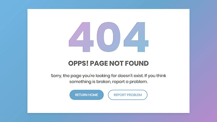
If you don’t already have a process in place for creating these pages, consider using something like Google search console or Bing Webmaster Tools to monitor when and where these errors occur.
You can also use tools like Screaming Frog to crawl your website and find pages that aren’t linked from anywhere else on your site. This will help you discover the 404 pages on your website.
Secure your website with an SSL certificate. Having an SSL certificate isn’t just nice to have anymore, it’s a must! you need it in order to prevent hackers from intercepting and stealing sensitive data.

If you want people to trust your site and feel safe completing transactions on it and exploring it, look into securing your site with an SSL certificate and even with security plugins for even stronger security.
If you have optimized your website and made the necessary changes to it, then what?
⇒ Do usability testing with real users!
Before you go ahead and roll out your new design, usability test it with real users. Usability testing is a quick, relatively inexpensive way to determine whether your site’s design really makes sense for people who haven’t been trained on how to use it.
If something doesn’t make sense or looks like too much of a hassle, fix it!
As your website grows and you get new users, start paying attention to how they interact with it. This is where tools like Hotjar can come in handy! they let you run a live web session with a customer and track their mouse movements around your site.
Watch what they do, listen to what they say, and write down exactly what they do (and don’t) like about it.
You should also ask for feedback from potential customers and even do surveys on your website, social media, and via emails.
So that’s how you can improve your website’s user experience in 2022. Now you just need to start executing. Begin by getting feedback from real people on what they do and don’t like about your site.
Work to incorporate their suggestions into your UI and look for ways you can continue to implement changes as you learn more about what makes users tick. It may take some time and effort, but if you’re willing to dedicate resources and energy toward improving usability, it’ll be well worth it in the end.
If you want to save yourself the hustle and a lot of time and effort, let a professional from Déclic Marketing Agency handle your website creation process with an optimized User Experience design CONTACT US NOW!
You can also check our web design expertise and services here.